Understanding color vision deficiency
Color blindness, more accurately called color vision deficiency, affects an estimated 1 in 12 men worldwide1, making it far more common than many people realize. It is a difference in how the eyes and brain detect and interpret certain colors, usually involving difficulty distinguishing between reds and greens or blues and yellows. This happens because specific light-sensing cells in the retina, called cones, are missing, less sensitive, or process signals differently.
Many people with color vision deficiency still see color but experience reduced contrast between specific hues. Because of this, tasks like reading color-coded charts, matching clothing, or noticing warning lights can be challenging depending on the lighting and design. While usually inherited and present from birth, it can also develop later due to eye disease, nerve damage, or certain medications.
There is no universal cure for inherited forms, yet practical supports like high-contrast labels, pattern-based designs, and accessible app settings make everyday activities easier.
Color carries significant meaning in games by indicating friend or foe, safe or dangerous, and selected or disabled states. When UI and gameplay cues depend entirely on color, a significant portion of your audience may miss vital information.
Color Vision Deficiency (CVD) affects an estimated 300 million people worldwide.2
Where we come in
Accessibility works best when it is part of the creative process from the start, not something added at the end. That is why we created a free collection of color blindness assets for Unreal Engine, designed to help you see how people with color vision deficiencies may experience your work and make clearer visual decisions along the way.
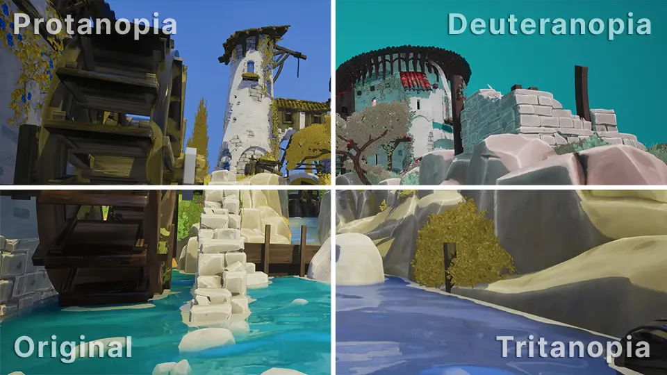
The pack includes simulations for:
- Deuteranopia (green-weak vision)
- Protanopia (red-weak vision)
- Tritanopia (blue-weak vision)
Alongside the included material functions, the pack also comes with post process materials that can be applied to individual environments or across your entire project.
The simulation model we used is based on the physiologically grounded research of Gustavo M. Machado and collaborators.3
How it helps
Many of the difficulties caused by color vision deficiency come down to a lack of clear visual separation rather than simply seeing colors differently. Without enough contrast, separate UI states can become hard to tell apart, and important gameplay cues may disappear into the background.
Common development pitfalls
- HUD states such as selected versus unselected, or cooldown versus ready
- Team identifiers and outlines, particularly when using red and green
- Minimaps and pings where markers share similar brightness levels
- Puzzles and mechanics that rely exclusively on color cues
- World interactions like loot rarity, interactable glows, or hazard zones
Design Rule: If a mechanic is required for progression, never rely on color alone to communicate it. Support it with icons, patterns, text, or clear value contrast so it remains accessible to everyone.
Comparing built-in support and our assets
Unreal Engine provides native color vision deficiency support which is highly effective for global previews or as a player-facing accessibility toggle.
Our assets are designed to complement those tools rather than replace them. They let you integrate color blindness previews directly into your existing materials and shaders for more flexible testing.
The flexibility of our assets
- Target specific objects: Apply simulations to individual meshes, UI elements, or interaction highlights to evaluate specific visual cues in isolation.
- Localized effects: Use the included post process materials to preview deficiencies within specific volumes or contexts instead of affecting the entire viewport.
- Per-player control: Enable previews on a per-camera basis in multiplayer environments, allowing one developer to validate accessibility without impacting the view of other testers.
User feedback
Below are reviews from creators who have used our color blindness assets in their own projects.
Was actually considering making a first person game at one point where you played as an animal, a lot of animals have different forms of colour blindness.
Nice! I'm badly color blind. I tend to oversaturate everything as a result. My post process volume is like, Really?
Thank you for doing this! My kids have color blindness, and it would be really helpful to have these filters.
Much appreciated! I'm converting a board-game prototype to digital, and this lets me refine icon color pairs without relying on blue/yellow distinctions.
Get the product
Download the Color Blindness product for free on the product page, where you can also find installation instructions and a complete overview of all included assets.
If this product improves your workflow, please consider leaving a review; we would love to hear how it improved your project's accessibility.
Test your color vision
The Ishihara Color Blindness Test is a quick way to check your vision. It shows dot patterns with hidden numbers that can help reveal certain types of color vision deficiency.
For the most accurate results:
- Standardize your view: Remove any tinted glasses or color-correcting lenses before starting.
- Adjust brightness: Increase your screen brightness to a high level to prevent color distortion.
- Screen size: Use a larger display like a laptop or tablet rather than a smartphone for a more reliable experience.
References
- Colour (color) blindness (colour vision deficiency, or CVD) affects approximately 1 in 12 men (8%) and 1 in 200 women. Colour Blind Awareness
- Estimate of people with color vision deficiency (commonly cited around 300 million worldwide). Colour Blind Awareness
- Machado, Oliveira, and Fernandes, color vision deficiency simulation model. Paper (PDF)